Hi all,
I’m slowly moving everything here to my new blog just rambling. There you can find my thoughts on Singapore newspaper design and more.
Thanks for reading and see you at my new blog!
Hi all,
I’m slowly moving everything here to my new blog just rambling. There you can find my thoughts on Singapore newspaper design and more.
Thanks for reading and see you at my new blog!
Filed under Miscelleanous
 I was browsing Basheer when I chanced upon Steven Heller’s working biography with Nigel Homes, the former Graphics Director of Time Magazine for just $10!
Not only was it a bargain, it was am enlightening and a breeze to read. Set in a question-and-answer format, Nigel takes Steven and the reader through his thoughts about how he got to do what he was doing, what information design is all about and how he does his work.
A trademark in Nigel’s work is a touch of wit and light-heartedness with “metaphoric” elements that some critics would say distract readers from the information graphic. But Nigel defends his approach:
“A good approach to information graphics includes an appeal to the reader, immediately followed by a true account of the story… I want to make room for enjoyment, delight, aesthetic appreciation and wit, and a friendly “you can understand this” approach.”
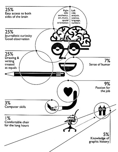
Published in 2006, Nigel Holmes: On Information Design, is a great book to find out what goes behind the thinking of this “explanation designer” (as he would like to called). In the spirit of his work, Nigel has even drew a graphic about what it takes to be an information designer:
Filed under Information Graphics
Been looking at some old newspapers for a research project and this issue of The Straits Times Classifieds section in 1989 caught my attention! The colours are like that because I took photos straight off the microfilm reader.

And here is a house-ad for the Classifieds

After the catchy headline, it actually goes on to read
“We lost count of the number of Classified ads that have been ripped out of our newspaper but who’s complaining.”
Filed under Newspaper Design
This infographic, The Crisis of Credit Visualized, has been around for a while now, and it very cleverly explains how the financial crisis happen. Watch the video from Jonathan Jarvis, an interaction and media designer, that is split into two for YouTube.
Filed under Information Graphics
Short but sweet. It’s a call out to empower designers to play a bigger role in newspapers. I second that.
Filed under Newspaper Design
Here is a revised final feature for this class. It is posted here for an assignment as part of COM412: Journalism Reimagined.
Filed under Miscelleanous
Here is some advice on doing a Final-Year Project based on my experience. It is posted here for an assignment as part of COM412: Journalism Reimagined.
Filed under Miscelleanous
Here is a portrait series I did with a friend. It is posted here for an assignment as part of COM412: Journalism Reimagined.
Filed under Miscelleanous
Halfway into the interview, Design Editor Edric Sng suddenly asks (one of many times) for my thoughts on TODAY’s newspaper design and that is when I fumble. It took me a while, but I remembered another blog’s gripe about how “texty” TODAY looks.
It turns out that the paper is intentionally text-driven, or “grey” for a reason — advertisements. Two-thirds of the newspaper is made up of ads, so rather than compete with ads with colourful visuals that would cut text, Sng says, “It just comes down to the lesser of two evils.” Thus, being grey helps the news to stand out.
Ads play such a big role in this free newspaper’s design because that is its only source of revenue. This is why Sng laughs when he talks about ST’s news design constraints, “You think they have it hard? Nonsense!” he says. Moreover, the paper’s space constraints are further limited by its tabloid-size, but Sng is clear that ads are why he gets paid.
Why TODAY is still in Times New Roman
When Sng led the three month long redesign of TODAY (he takes another swipe at ST for doing theirs in six) the one thing he was not allowed to change was the nameplate. As a fledgling newspaper, it could not afford to undo the branding work for a paper still trying to establish itself. That aside, everything went out of the door as Sng streamlined a paper too thin for too many different styles. He used just three colours of red, black and grey (business section was blue for marketing reasons) and two styles, one for daily and another for the weekend edition.
The redesign’s three guiding concerns were as follows: space constraints, making day-to-day design “idiot proof” and costs. Only two people led the redesign, Sng and his managing editor, and this he says led to a more coherent redesign than ST’s, which even had its nameplate’s typeface changed a day before launch. “We don’t believe in redesign by committee (like ST)… the problem is a lot of people don’t know what they are saying.” he says.
This lack of visual journalism knowledge here is one reason why Sng is considering lecturing when the opportunity arises. Education is how to improve newspaper design here, he says, especially since Singapore newspaper’s editors are mostly “dinosaurs” who only see journalism as text. Sng thinks at least 30 per cent of stories in today’s papers can be in alternative story formats like infographics, though it is the “hardest damm thing” to do too.
Another reason for the lack of innovation in newspaper design here is the lack of impetus with just two media companies. But though the odds seem stacked against improving things here, Sng has, and maybe, embodies the solution. After listening to my gripe about the situation, he says, “What’s the solution? Passion.”
—
This concludes the two-part interview that The Paginator had with Edric. Read his thoughts on the importance of text to the good design of a newspaper here.
Filed under Newspaper Design

